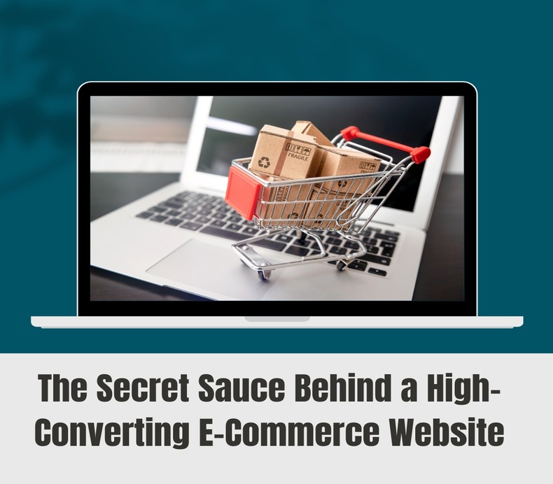
Man, launching an online store feels like skydiving adrenaline, hope, and a dash of “please don’t let this crash and burn.”You set up this killer website, handpicked products you’re convinced people will drool over, maybe you even dropped some cash on ads. And then… flies.
You watch as people wander in, poke around, toss stuff in their cart like they’re at Target, and…poof..gone. No “thank you,” no sale, and It’s almost personal, right?
Honestly, you’re not cursed or anything. This is just how the game goes. Most people (like 97 out of 100) will leave your site without making a purchase. But here’s the kicker: the big dogs in e-commerce aren’t just twiddling their thumbs, hoping for luck. They’ve got a playbook a weird mix of science, psychology, and, I dunno, witchcraft that turns browsers into buyers.
So, yeah, let’s rip open this “secret sauce” and see what’s really cooking.
1. Lightning-Fast Loading Speed
Let’s be real, nobody’s got the time (or patience) to sit there staring at a spinning wheel. If your site drags its feet past three seconds, half your audience is already ghosting you. That’s not just a bad day; that’s a ton of lost sales. Ouch.
Here’s the thing: people judge. If your site’s crawling, they’ll start wondering if your shipping’s gonna be just as slow. Not a vibe.
🛠️Quick fixes
- Shrink your images, but don’t make them look like pixelated memes.
- Get yourself a hosting service that isn’t run by hamsters on a wheel.
- Flip on browser caching.
- Ditch all those clunky scripts and useless plugins.
Basically, your website’s speed is like the first handshake. If it’s slow and limp? Yeah, people remember.
2. Intuitive Navigation & Search
Your online store’s like a giant supermarket, right? If folks can’t find the cereal aisle, they’re out. No one wants to play hide-and-seek with their shopping cart.
☢️Keep it simple:
- Menus that actually make sense (like, “Men’s Shoes → Sports Shoes → Running”).
- Filters for size, color, price, all that jazz.
- Sticky buttons—so “Add to Cart” and “Wishlist” are always in sight, not playing hide-and-seek.
- A search bar that’s smarter than your phone’s autocorrect. Spelling mistakes? No biggie.
If people can find what they want in like two clicks? They’re way more likely to buy. Makes sense, right?
3. Mobile-First Design
Look, it’s 2024—everyone and their grandma is shopping on their phone. If your site’s only pretty on desktop, you’re basically ghosting most of your customers.
📲Mobile must-haves
- Responsive design that actually fits any screen (not just “kinda works”).
- Big, chunky buttons your thumb can’t miss.
- Minimal pop-ups, no one wants to play Whac-A-Mole to see what they’re buying.
- Dead-simple navigation. Nobody’s scrolling for days.
Seriously, less is more. If your mobile site feels like a maze, people will simply bounce.
4. Trust-Building Elements
People are giving you cash and their life’s info. They need receipts that you’re for real.
🔐Trust boosters
- SSL certificate (yep, HTTPS or bust).
- Return, refund, and shipping policies where you can actually find ‘em.
- Reviews, photos, testimonials—real humans, real opinions.
- Contact info or live chat. Don’t make people dig for it.
- Those little trust badges for payments? Slap ‘em on.
Bottom line: The more you look like the real deal, the faster folks whip out their cards.
5. Killer Product Images & Videos
No one’s walking into your store. Your pics do the talking. If your photos are blurry or look like they were shot on a potato, good luck.
🚀What works
- Show off every angle.
- Zoom in on the details. Is it soft? Is it shiny? Show me.
- Lifestyle shots—let people imagine using it.
- Short demo vids. Honestly, videos sell. Numbers don’t lie.
Pics talk. Make sure they’re saying, “You need this.”
6. Persuasive Product Descriptions
Don’t just drop a list of features—tell people why they should care.
Example:
❌ “Stainless steel, 500ml.”
✅ “Keeps coffee hot for 8 hours—so you actually get to enjoy it, even if your day’s a trainwreck.”
💯Pro tips:
- Lead with the big benefit.
- Keep it punchy, easy to skim.
- Bullet points for features.
- Sprinkle in keywords, but don’t go full robot.
7. Frictionless Checkout
If your checkout’s a pain, people will bail. Every extra step? More time for second thoughts.
🚀Keep it smooth:
- Let people check out as guests. Not everyone wants an account.
- Progress bar, let them know how many hoops they’ve got left.
- All the payment options. UPI, cards, wallets, COD—you name it.
- Autofill addresses. Tech exists, use it.
Checkout should feel like a sprint, not a marathon.
8. CTAs That Actually Work
“Submit”? Snooze. Your buttons should hype people up.
Examples
- “Buy Now”
- “Get Yours Today”
- “Add to Cart—Limited Stock”
Words matter. The right CTA makes people click, not think.
9. Personalization & Recommendations
Nobody wants to feel like just another browser. Make it personal show them stuff they’ll actually want.
Try
- “You might also like…” sections.
- Special deals just for them.
- “Remember this?” reminders for stuff they peeked at.
When people feel seen, they spend more. Go figure.
10. Don’t Ghost After Checkout
The sale’s not the end it’s just the beginning, really.
🔔Do this
- Thank-you emails with order info.
- Discounts for next time.
- Ask for reviews (throw in loyalty points if you’re feeling generous).
- Keep ‘em posted with tracking.
Treat your repeat buyers like VIPs. It costs less to keep ‘em happy than to win over newbies.
The Final Recipe
There’s no silver bullet here it’s a mix of speed, trust, simplicity, a dash of persuasion, and a little post-purchase love. Your site’s not just a store, it’s your all-hours sales squad. Take care of it, tweak it, and watch strangers turn into regulars.